Just so you understand what I started with...here is what the living/tv room used to look like before we renovated. Pretty scary, huh? Love that shag carpet and paneling.
 This was the view into the corner of the room and the foyer and stairs. More of the same ugly.
And here is what it looks like now. What do you think? I really love it. I have to point out that we did ALL the work ourselves (I guess that's why it has taken almost 5 years!).
I wanted to redo the fireplace and make it more in keeping with the feel of the house, which was built in the early 1900's. Since the fireplace was so old, it was not safe to use as a wood-burning fireplace. It was totally unlined and much of the mortar was not the best. So I went with the next best thing. I went with an electric insert. We do not have gas service to the house, so this was about the only alternative.
 The fireplace mantle was from an 1890's farmhouse in Ohio. I got it at a great price at a local antique store. I went with the marble hearth and the surround is white glass tile in a matchstick pattern. I love how it glitters. And I am glad I went with this size of tile because the larger subway tile was too big for the scale of the area. The hood on the top was from eBay. You can see more about the original here. You might notice that they hood is now silver which matches the other finishes in the house. I will show how I did the silver leafing in another post. And it cost less than $8 to do!
My huge IKEA couch. It is rather big, but we do have 5 people in our family. And even though I have 3 boys I did go with a white couch. The slipcovers are easy to wash and I have 2 sets. I also have a matelasse coverlet across the seat that I can easily throw in the wash and I like the texture. I also change out the pillow covers as the seasons change.

Another view of the couch and foyer. Max loves to lay by the fire and sleep.
 The view of the room from the foyer.
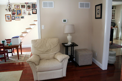
Here's that corner again. I'd have to say that it is improved. If you look in the foyer, you can see one of our remaining projects --the railing on the stairs.
Sources: Flooring - Brazilian Cherry, Lumber Liquidators; Wall Paint - Pottery Slip Eggshell, Valspar; Trim - ProClassic Semi-Gloss in White, Sherwin Williams; Glass Matchstick Tile- Oyster, Designer Stone Outlet.
Sources: Flooring - Brazilian Cherry, Lumber Liquidators; Wall Paint - Pottery Slip Eggshell, Valspar; Trim - ProClassic Semi-Gloss in White, Sherwin Williams; Glass Matchstick Tile- Oyster, Designer Stone Outlet.
We had to keep pretty much the same footprint as we started with due to support walls, but I think I succeeded in getting more of an open feeling to the house.
I'd love to hear what you think!


Wow! It looks awesome! What a transformation! LOVE it! You guys did such a beautiful job! :)
ReplyDeletewow, it's fantastic, your work is amazing. It looks cozy & peaceful. love it
ReplyDeleteOMG, this is sooooo different. I love it. I'd have never had the vision for such a drastic change. Not to mention that my hubby would have loved all that wood that you started with. Great work and vision girl. It looks so cozy to be in now.
ReplyDeleteits really pretty. lovely work =)
ReplyDeleteIt looks amazing! It's so light and airy, but still feels like a room I could cozy up in. I bet you love it!
ReplyDeleteWow, Cari, that is so pretty. I can't believe how different it looks. I love the white slipcovers--use them myself. And the fireplace--beeeeyoooot.
ReplyDeleteHi Cari,
ReplyDeleteThanks for stopping by and leaving a comment on my blog today.
I must say WOW to this room makeover. I love it. AND you have 3 boys too. Mine are all grown but they were raised on white slipcovers also. I just love the fireplace. That's the one thing missing in our old house. I may be contacting you for more info on that.
~janet